
Modern sales pages come from a time where salesmen would physically mail sales letters to their list of customers. The letter was strategically laid out with the “fold” being the most important part of the letter. The fold was everything that was visible when the reader unfolded the first part of the letter. This was the reader’s first impression and it was important to get this right!
Since letters have moved on to the Internet, the style has changed… at least slightly. The Internet allows us to really “trick out” or embellish the sales page. One advantage is that we can easily change the look or layout of the sales page — even during launch. It’s also a whole lot easier to split test your pages and determine the best page to use for your big launch.
The ability to add videos to the sales page has been one of the most powerful advancements in online selling. You no longer have to rely on a picture of yourself to establish your brand. You can be in your video talking about your product and better yet, be demonstrating the product. Nowadays, if you want a high converting page, you’ll want to add a video for sure.
Even though the sales page is now digital, one thing hasn’t changed — you still have to sit down and put a lot of thought into your sales pitch. You have to use a particular order to describe the problem, the solution, how your product PROVIDES the solution, and the close itself. You still have to know who your target audience is and what their pain is. You have to write to them and speak to their needs and wants. You might be online, but you’re still communicating just like you’re writing a good ‘ole fashion letter.
The modern digital sales letter is an awesome selling tool. The ability to add videos to your copy definitely boosts sales in most niches. The electronic nature means the split testing sections of the copy is easier and faster than paper mailing. Nevertheless, whether you’re writing digital or paper copy, you’re still sitting down to write to a person. And in that regard, copywriting is unphased by technology.
THE DECK IS YOUR MOST VALUABLE PIECE OF DIGITAL REAL ESTATE
In a lot of ways, a sales page is like real estate for your sales pitch. When you’re designing your sales page, where you place your headline, product images, graphics, and elements of your copy matter. Different sections of the page have varying levels of value — the “Deck” being the most valuable piece of real estate on your domain.
The “Deck” is like the visible fold in the letter, it’s the area of the screen that is instantly visible when your sales page loads on your prospect’s device. It’s usually around the first 6 inches of screen on a PC or laptop, but of course this varies by device. Because every prospect sees this section, it has to be managed like every pixel costs your hundreds of dollars.
PRO-TIP: Check your sales page on multiple devices (and operating systems) to see what is visible when you first pull up the page. And when checking, make sure you’re logged out of the site since the WordPress admin bar will affect the results.
Before we start talking about what should go where on a sales page, let me be clear on a few things.
#1 There is no “one size fits all” sales page formula that will magically work for every product and audience all the time.
#2 There are many important sales page factors. The type of product, the target audience, the niche, the price point, the platform, and even the time of year can all play a role in sales page performance.
#3 Many elements need to fit well together on your sales page. The OFFER, the sales copy, the images, the page layout and design, color palette fonts and much more. These are all variables that play a role in conversion.
There are many factors at play here. In other words, you may have some BANGIN’ sales copy but a terrible looking design and a horrible video that could kill your conversions. Our goal with this information is just to cover the basic components and present you with a few ideas that might get your wheels turning.
For starters, there are a few simple components that we can cover in the Deck and they generally apply to MOST types of sales pages. The first of these is called the header. Many JVZoo sellers like to use a simple, clean logo in the header. It’s just there to help establish the branding.
Next generally comes the headline that touts the big benefit that your product provides. Some sellers use a pre-headline to grab attention before giving them the main headline shocker. For example…
PRE HEADLINE: Attention Newbie Internet Marketers…
HEADLINE: “This NEW Cutting Edge Tool Does XYZ Without Having To ZYX!”
The sales video generally comes after the headlines and should be visible from the initial page load. We could write pages and pages of information about creating sales videos but the key here is that you engage the viewer and get your sales pitch across.
The deck wouldn’t be complete without a Buy button. This is because your deck should generally be powerful enough to convince your prospect to buy right away. However, the rest of the page is there to help readers who need more information before making a purchase decision.
It’s a good thing to mention that SCARCITY is another component many marketers will add to their header. In the event that your pricing is going up, you may want to add a countdown timer and warning in the header or just below the sales video. You’ll want to establish right away that your price may be going up because this will increase the visitor’s impulse and propensity to buy now versus later.
Likewise, if you’ve earned the product of the day award, you may want to claim your success by mentioning it in the header because this serves as social proof which also increases impulse. Some vendors even insert a small ribbon image in the header similar to this one:
IMPORTANT NOTE: If you value your JVZoo account you’ll ONLY use this seal if you can prove that you were in fact awarded POTD. Don’t ever falsify this privilege.
Keep in mind, the deck is the only part of your page that every prospect is definitely going to see and that’s why it’s so important. As we’ve said before on another post, you don’t get a second chance to make a first impression. So make sure everything looks good from the start so you can keep your prospects on the page.
ESTABLISH YOURSELF AS THE AUTHORITY ON THEIR PROBLEM
Following “the deck”, the next part of your sales page is where the meat of the sales copy begins. A good practice here is to substantiate or PROVE any claims that you made in the headline. For example… if you started off by saying something like “Discover My Method To Make $500 Per Day” … then it may be a really good idea to show some proof of that here.
Proof is particularly important for raising trust on pages where you make income claims. We are not lawyers and this isn’t legal advice but you should ALWAYS be able to demonstrate that your claims are real if asked to do so. As an online seller, you should be aware of the FTC standards when it comes to claims and proof. You can learn more on the FTC website: https://www.ftc.gov/tips-advice/business-center/advertising-and-marketing/online -advertising-and-marketing
Building trust and rapport on your sales page is paramount. The first part of the sales copy should focus on connecting you to the prospect by first establishing authority and trust. The prospects will want to know upfront that you know what problem or pain points they are facing. They’ll expect you to know what it’s like if you have the solution. More importantly, they need to see that you’re an expert on the problem and not some loudmouth, know-it-all in the digital bar. You should set the tone and manage all these expectations in the first half of your copy.
Selling software and selling training courses are very different. If you are positioning YOURSELF as the expert with the solution they need then the sales pitch should come FROM YOU. The sales copy will generally start with a greeting and it’s a good idea to use a picture of yourself, plus a dynamic date (the web page should display the current date) in the opening salutation. When choosing a picture, be sure to select a photo of yourself from the shoulders up, and where you’re smiling. You want to establish yourself as a friendly person who’s ready to help them.
It’s a good idea to immediately address the problem your prospect is facing. Be very descriptive in discussing the problem and your experience dealing with the main issue. For example, if you’re in the social media niche and your fan pages weren’t getting as many likes, shares, and comments as they used to. You can talk about the struggle to get people to your fan page and the things you had to deal with day in and day out. The key is to establish yourself as someone who knows and UNDERSTANDS what the reader going through.
After you’ve described the problem, you’ll want to transition to the “imagines”. The “imagines” are just descriptions of what it’s like to have the problem solved. So you, as a social media expert, might say “Imagine getting dozens of new likes, shares, and comments every day with a click of a button.” Or “What if you could grow your fan pages on autopilot with two minutes of work per day?” The imagines section creates the dream of a place where their problem has been eradicated.
You’ll want to prove you’re an authority on solving the problem. The prospects will need to know why they should trust you to solve the problem. So you’ll want to talk about how you became an expert on the topic. You may also want to show more proof, depending on the niche of course. This is where social proof, endorsements, and testimonials can play a big role.
PRO-TIP: If you’re very new to Internet Marketing, proof of your personal income may be hard to come by. In that case, you may want to focus on the income that others have made using the same techniques your product covers. DO NOT EVER “FAKE IT TO MAKE IT”.
Now that you’ve established that you understand exactly what they’re facing, you’ve got them warmed up and ready to discover the product.
INTRODUCING THE GREATEST PRODUCT EVER CREATED
Once you’ve established rapport with your prospects, it’s time to show them the product they’ve been waiting for. The tone and focus will naturally pivot towards the feature and benefits of the product, and the results it brings.
The product should be introduced with a large, high-quality image. Visual representation of your digital product is super important because the mind thinks in pictures. If they can’t see it then subconsciously it does not exist. We’ve seen JVZoo experts do this a variety of ways with various image types, big bundles of computer screens, DVD cases, eBooks, software boxes, and more.
Remember digital products are harder for people to visualize owning. If you’re selling a video course that is just a series of players on a membership site, you want to consider placing DVD mockups on your sales page. This will help your customer visualize owning your video course even though it isn’t being physically mailed to them.
Once you’ve displayed your product, you can go into the features and benefits. If you’re selling a video training course, for example, you may want to describe the features and benefits of each module. The prospects will want enough details to be assured that the problem you promised to solve is solvable by the product you’re selling them
Benefits are what sells the prospect.
Every Time you mention or list a feature you should always follow it up with the BENEFIT that the feature will give them.
Social proof goes a long way here too. Keep in mind that your previous customers can out-sell you 10 to 1, so use plenty of high-quality testimonials. The testimonials give assurances to the prospect that they will get the results and benefits you’re promising them. You’ll want as many testimonials as possible, and each one should relate to someone in your target audience.
And finally… Here’s something that a lot of top sellers do, you should consider adding a BONUS PRODUCT to the offer. The bonus should complement the main product. It may have a small list of features and benefits and a small image that doesn’t detract from the main offer. The bonus product serves as a way to pile on the value and an incentive to buy immediately. A little bonus offer may really help convert the prospects to buyers!
SOME PROSPECTS MAY NEED A LITTLE MORE CONVINCING
Effective closing techniques don’t have to be hard or intimidating. All you’re doing when you close the sale is helping the prospect make the decision to buy NOW instead of putting it off. Yes, closing is much more assertive than any other phase in the copy. However, if the prospect has reached the closing section and still hasn’t hunted down the Buy button and smashed it, a little more convincing in an assertive manner will help here.
The close starts with a recap of the main features and benefits of the product. You’re telling them what they’re getting when they buy TODAY. The tone you’ll want to use is that of the assumed sale — let them know what they just ordered even though they haven’t bought yet. This will add the confidence you need to lead them to the decision. Additionally, it is prudent to tell them what will happen next – immediately after they purchase, where they will be taken and what they will see.
Even after all these best efforts, some prospects will STILL have objections to buying. Its par for the course, don’t sweat it. You can anticipate the most common objections and bring them up proactively. If you raise the objections yourself in the copy, you can then overcome them in an empathic way before the prospect even thinks of it.
PRO-TIP: A great place to overcome objections is the FAQ section. You can place an FAQ below your main Buy button to help your prospects make a decision in a different area of your sales page. FAQs may be viewed by some prospects as less “salesy”.
Many online marketers use a price justification segment to explain why the offer is such a great deal. During the price justification, you can bring up the value of each component that your offer contains. You’ll tell them how much it would cost to buy each component separately. During the justification, you’re simply explaining why your offer is a great deal.
PRO-TIP: Price justification is not comparing an unrelated item to your purchase price. For example, if your training course is priced at $19.95, you don’t want to say “For the cost of a pizza, you can get my training course.” Price relativity is not price justification.
Adding a guarantee and/or refund policy to your offer is generally a good idea. Many marketers will use a 30 Day, Money-Back Guarantee, but you can use any timeframe you want. People like to feel like they can undo any transaction if it doesn’t suit them. Adding the guarantee lets the customer feel like you’re taking all the risk because you’re confident in your product. While no marketer wants a ton of refunds, it’s a good idea to have a guarantee to increase your sales overall.
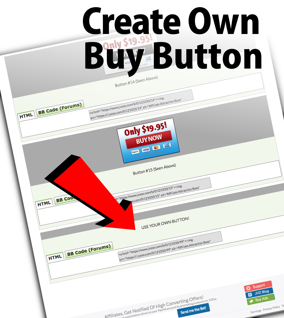
The order area is the section of your sales page where they can buy your product. You’ll want to make this area look different than the rest of the page so it stands out to people who are just scanning the page. The goal of the order area is to get them to buy with confidence, many experts use a checkmark bulleted list summarizing everything they’re about to purchase. JVZoo offers a variety of button styles of that work great. You can always design your own button and add JVZoo’s button code to it as well.
There are many order buttons for you to chose from inside of JVZoo and you can also use your own button image as long as you insert the required JVZoo code.
From the seller’s dashboard click on the green “edit actions” button for any of your products to open the dialog and select “buy buttons”. At the bottom of the buttons page, you’ll see the code for using your own button.
Be sure to copy this code and insert YOUR button image path when you paste it on your sales page!

The “Sign Off” is the bottom section of your sales page just before the footer. This is where you can add some brief closing remarks to raise impulse and your signature and picture. You may also want to add some postscripts (P.S.) to recap the features. Many prospects scroll all the way to the bottom first, we call them “phantom scrollers” and using a P.S. recap that reads almost like a headline is a great way to grab their attention while summarizing the offer.
ALWAYS BE OPEN AND READY TO ADJUST YOUR SALES PAGE
Once you’ve set up your sales page, you may need to make some adjustments in order to get the best possible conversions. Don’t get too emotionally attached. Rarely does the very first version of the sales page yield the highest converting version. Trust the data over your gut here. Also, when you share your sales page with your affiliates, you should ask for opinions on the offer, the sales copy and even the page design. They know their subscribers better than you, be open to their suggestions. You might need to make changes, so be prepared well before your launch!
The headline is another item that will sometimes need modification. The headline has to grab the prospect’s attention and engage them emotionally. It sets the prospect’s expectation of what’s going to happen on the sales page. This means some prospects may bounce immediately if they don’t believe the page is relevant to them.
The offer is one of the first things you may want to test. You may find that your description of the offer needs sprucing or that you need to add additional value. You might change the price justification or the price itself. Don’t presume that a lower price will sell more as that’s not always the case and you never know until you TEST. There’s a variety of ways you can position the offer or modify it for maximum conversions.
PRO-TIP: JVZoo has a built-in A-B split test feature that allows you to alternate visitors to different versions of your page and tracks which version is converting the best. We recommend that you ALWAYS TEST YOUR SALES PAGES and then roll with the highest converting page.
The layout, design and color scheme may need some tweaking too. Some color schemes convert better than others. You’ll want to be cautious with the use of red, for example. Red often means “Stop” or “Danger”. You can use it very sparingly when you want the prospect to notice a point, but consider avoiding it as one of your theme colors. Share your color scheme with your top affiliates before creating your sales page and product images around it. They’ll let you know if their lists will reject the colors or not. Know that certain colors create certain emotions in prospects.
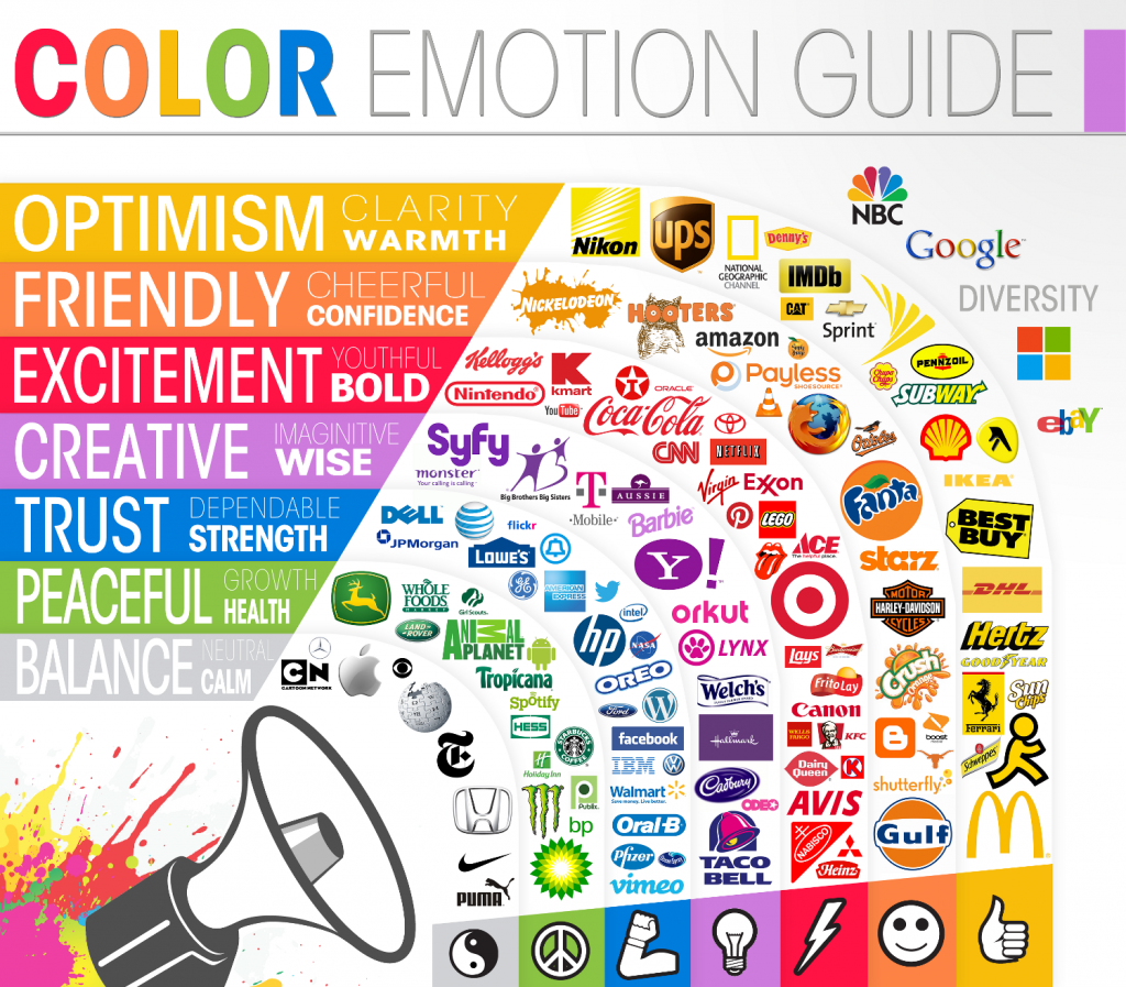
IMAGE CREDIT: The Logo Company https://thelogocompany.net/blog/infographics/psychology-color-logo-design/
If you are in the process of creating and launching a product right now then we recommend that you NOT leave the sales page creation to the last minute. You’ll want to make sure your sales page is ready with plenty of time for your affiliates to review and provide feedback. Ideally, it should be done a few weeks beforehand so you can drive private traffic to it and see how it converts too. Be prepared to make changes to your page BEFORE you launch. Making changes during the launch while the page is LIVE can be problematic. Invest the time finding out what works the best and never use your affiliates as guinea pigs!
1 Response to "YOUR SALES PAGE IS LIKE A LETTER TO YOUR PROSPECT"
Could you suggest a software for creating sales pages like those on JVZoo? I cannot locate the software recommended on your website, “Sales Page Sorcerer”.
Thank you